Written by Kelsie Pinkerton — founder of Pinkerton House and a former luxury wedding photographer who spent two decades building a brand where thoughtful website design and strategic presentation directly influenced bookings.
Short Answer
A Showit template can absolutely look custom — but the key is knowing what to change and what to leave alone. Focus on the elements that are unique to your brand, like curated imagery, typography, copy, and color, while preserving the structure that helps visitors and search engines easily understand and navigate your site.
Why This Matters More Than You Might Think
One of the biggest hesitations we as creatives have about using a template is the fear that our sites will look, well, like everyone (or anyone) else’s 😱.
But the truth is that most websites begin with some kind of framework. What makes them feel custom is the way that framework is interpreted and brought to life through your work, your voice, and your brand.
The trouble usually starts when people begin changing the wrong things.
When too much of that thoughtful, intentional underlying structure gets rearranged — sections removed, hierarchy shuffled, navigation overcomplicated — the design can quickly lose the clarity that made the template so effective in the first place.
And that clarity matters not only for visitors, but for search engines and AI trying to understand what your site is about. If you need some clarity on what it means for a template to be SEO-friendly, start here: What “SEO-Friendly” Really Means in a Showit Template.
What Actually Makes a Website Feel Custom
When a website feels custom, people are usually responding to a few key things:
- imagery that feels cohesive, curated, and intentional
- typography that matches the brand personality
- copy that clearly reflects the voice of the business
- color choices that reinforce the overall mood
These are the elements that give a site its identity.
Lucky for us, they’re also the easiest things to personalize without disrupting how the website works.
What Not to Change First
Where people often run into trouble is trying to redesign the structure before they’ve really begun to use it.
Templates are built with a particular flow for a reason — to guide visitors naturally through your work, your story, and right to the next step in working with you.
Changing that flow (likely carefully built to help your site convert and get you found in search engines) without some real know-how can make your site confusing and harder for visitors to navigate. It can also make it harder for search engines to interpret and index your content so it can start showing it to the right visitors.
So, before changing structure, focus on content.
SO often, once your images and copy are in place, the design already begins to feel like you.
The Four Changes That Make the Biggest Difference
If you’re ready for your template to feel like your own, start here.
Curation is your superpower
Your images are the clearest expression of your brand, and the best photographers and artists are master curators.
They absolutely have years of experience and skill development under their belts, but often it’s how they choose what they show you (and where, and in what order), that goes the extra mile to set them apart. The best photographers are expert at telling a story through their images.
Take a look through the work of someone who really inspires you and you’ll see it:
- the variety and sequence that draws you in and makes you need to keep scrolling or flipping
- the color palette and editing that makes it all cohesive and gives off a distinct vibe
- how you know it’s their image before you see the photo credit
- how the photos -though all of different people, different places, different emotions, different events– seem to fit together like a jigsaw puzzle
- how their work on the whole really does give you a window into who that photographer is and how they see the world
- how nothing seems out of character or out of place
- how the photos they’re displaying attract more of the same kinds of work
Wherever you’re at in your creative business journey, you can learn to be a master curator.
What’s even better… curation is a skill you can put to work right now for an instant impact on your website template. Being sure to feature work that feels cohesive and tells a story will instantly make your site feel intentional and recognizable.
Adjust typography thoughtfully
Typography (a.k.a. your font choices) set the tone faster than you might expect. A soft serif might feel romantic and editorial, while a crisp sans serif leans modern and minimal. Thoughtful font choices — and small tweaks to sizing or spacing — can completely shift the personality of a site without touching the layout.
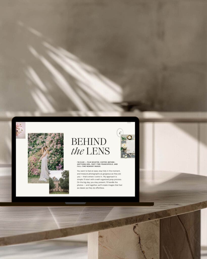
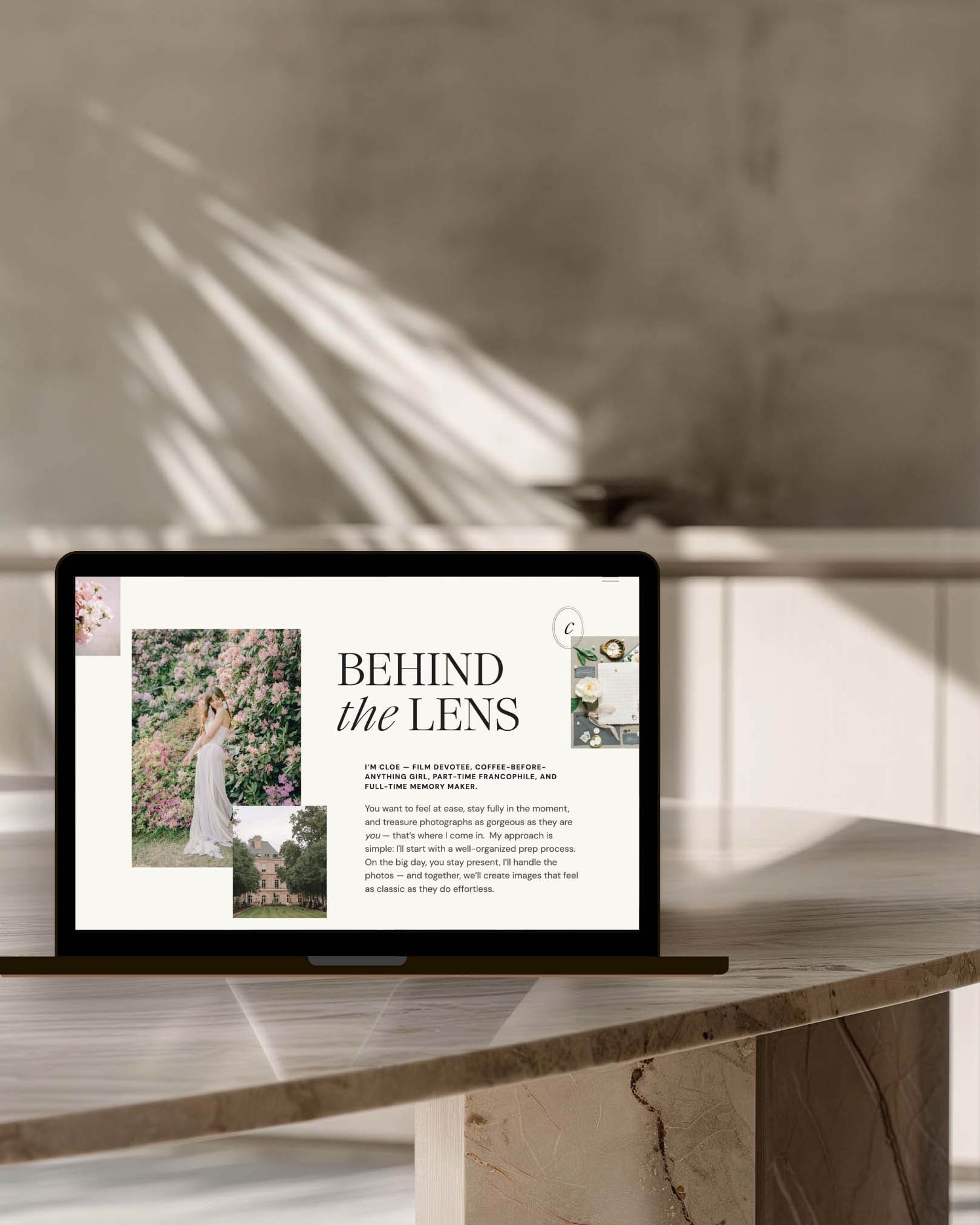
For example, pairing something like Jen Wagner’s Ethic Serif with a clean, minimal supporting font can instantly create that elevated, editorial feel many creative brands are after and that you’ll find in my Cloe Showit template.
Typography is also part of your brand storytelling — the same imagery can feel dramatically different depending on whether it’s framed by something modern, classic, or romantic.
Write copy that actually sounds like you
Even the most beautiful design will feel generic if the words could belong to anyone. Clear, specific copy — the way you describe your work, your process, your why, and the people you love working with — goes a long way toward giving a site it’s personality and is often what turns a beautiful website into one that actually books clients. This is also exactly why I build intentional copy prompts into each of my Showit templates.
This 👆 paired with your curated work makes the difference between a site that feels templated and one that feels unmistakably yours.
Use color with intention
Color quietly shapes how your work is experienced. A neutral palette with little contrast can make a site feel calm and refined, while stronger contrasts or vibrant colors can feel energetic or modern. Ask any buyer psychologist and they’ll tell you – color choices matter.
If you’re not sure what your brand colors are or where to begin in honing them, here’s a simple place to start: open Pinterest and search for color palettes for your industry or words that describe the vibe of your work. This is an easy way to find color inspiration. You can even save images with palettes you love so you can open them in tools like Canva or Photoshop and use the eyedropper tool to find their exact Hex codes to plug in to your template design.
Now, you don’t need to stress about choosing the exact, magical colors that will make you irresistible to perspective clients 😉. Your palette doesn’t need to be perfect — it just needs to be a small, intentional palette that supports the mood of your work and keeps the focus where it belongs: on your imagery.
Why Structure Still Matters
It’s easy to think of a template purely as aesthetic design (hello, our job is to make beautiful things), but on a strong template, the structure underneath is doing important work.
Clear hierarchy and flow helps visitors move through your site without getting confused or distracted. It also helps search engines and AI understand what each page is about — your work, your services, and your expertise — so it can start ranking and referencing your site to those right fit clients. I go deeper into this in my article on what “SEO-friendly” actually means in a Showit template.
A strong structure also supports blogging, which remains one of the most effective ways creative businesses build search visibility over time.
When that structure stays intact, your website can work much harder for you behind the scenes.
Pinkerton House Perspective
Over the years, I’ve watched photographers worry that using a template might somehow make their site feel less original. In reality, the opposite is often true.
A thoughtful framework removes a huge amount of guesswork and lets you focus on the parts that actually communicate your brand and value — your unique images, your story, and the experience you create for your clients.
This is why Pinkerton House templates are designed to balance flexibility with structure. They give you room to make the site your own while still preserving the clarity and strategy that help your business grow.
Key Takeaways
- A template can absolutely feel custom when the right elements are personalized.
- Imagery, typography, copy, and color have the biggest impact.
- Major structural changes are rarely necessary in a strong template.
- A clear framework helps you, visitors, and search engines understand your site.
FAQs
Will people be able to tell my site is a template?
Usually not. Once your curated images, copy that sounds like you, and brand elements like your logos, fonts, and colors are added, your template will look unique and recognizably yours.
Will customizing my template hurt SEO?
It can if the website’s structure becomes confusing or you remove clear hierarchy in the process of customizing. Thoughtful customization that keeps the framework intact usually supports search visibility rather than hurting it.
Should I change the layout of pages if I want my site to feel unique?
If you’re starting from a strong template, in most cases, it’s smarter to customize the content first. Once your images and copy are in place, the site often feels far more unique and distinctive without having to make major layout changes.
How much customization is too much?
If you find yourself rebuilding sections from scratch or redesigning the entire page flow, it may be worth stepping back and asking whether what you’re doing is really necessary. If the answer is yes and you’re not particularly knowledgeable about how a website should be structured for SEO and conversion, it might be helpful pause and get some template customization help from an expert.
Next Steps
If you’re looking for a Showit template designed to feel elevated from the start — while still having growth strategy built in and giving you the flexibility to make it your own — you can explore the Pinkerton House template collection.
And if you’d rather have hands-on guidance customizing your site so everything feels cohesive from day one, my done-for-you Website Design Experience may be the right fit.
Kelsie Pinkerton is a Showit website designer and founder of Pinkerton House, with 20 years of experience in the luxury wedding industry.


")


")

")
")
")

")

")
")


https://shorturl.fm/dVsFp