20+ years as a wedding photographer + now designing Showit websites built to help creatives get found, connect, and book the right clients with ease.
Quick Answer:
Most photographers assume luxury websites are defined by expensive branding, custom design, or a particular aesthetic.
In reality, the best luxury wedding and photography websites usually have something else in common:
They’re expertly curated.
The images feel intentional. The design feels cohesive. The experience feels effortless and naturally draws the visitor deeper in.
And often, it’s the small decisions about what to include—and what to leave out—that make the biggest difference.
The Pinkerton House Perspective
A few years ago, on a rare kid-free outing with my husband, I stepped out of the Phoenix heat and into an Anthropologie.
Cue the angels.
The dreamy scent, the rich textures, the perfectly coordinated palettes…within about thirty seconds I had convinced myself I probably needed everything in the store.
They’re good.
But here’s the thing:
Anthropologie isn’t successful because they have more products than everyone else.
They’re successful because they’ve mastered the art of curation.
They carefully select what belongs…and what does not.
Every piece contributes to a larger story.
The best luxury photographers do exactly the same thing.
And the best luxury photography websites do too.
When someone lands on your website, they’re not just browsing your images.
They’re experiencing your taste.
Your perspective.
Your attention to detail.
Your ability to guide them through a story.
Luxury isn’t just what you show.
It’s how you curate what you show.
1. Fewer Images, Better Images
One of the quickest ways to elevate a photography website is to show fewer photographs.
“But Kelsie, I’m sure they need to see every single beautiful angle I captured of this gorgeous invitation!”
Oh I know this urge. After 20 years in the wedding industry, I really do.
But luxury brands rarely overwhelm people with options.
They curate.
Instead of showing fifty strong images, they might show fifteen images perfectly suited to the bride they’re trying to attract.
Every image earns its place.
Every image contributes to the story.
A good question to ask yourself:
Do I want to do more work like this?
If the answer is no, it probably doesn’t belong on your website.
Dream clients are looking for images they can see themselves in.
Don’t make them work too hard to find them.
2. A Portfolio That Feels Like A Collection, Not A Storage Closet
One of the easiest ways to spot an elevated website is that all of the images feel like they belong together.
Not because they were all photographed at the same venue.
Not because everyone is wearing the same color palette.
But because the photographer has a clear point of view.
The images work together like pieces of a puzzle. And together, despite all of the variety in subject, location, colors, timing…they fit.
That’s curation.
3. Consistent Editing Creates Trust
Luxury websites feel cohesive, in large part because the imagery feels cohesive.
When visitors bounce between bright and airy, dark and moody, film-inspired, heavily saturated, and true-to-color editing styles all on the same page, it can leave them feeling confused.
Consistency creates trust.
And trust helps people feel confident reaching out.
4. Breathing Room
Luxury websites rarely feel crowded.
Everything has room to breathe.
The images.
The copy.
The design.
The experience.
One of the most common mistakes I see photographers make is trying to fit too much onto every page.
More images.
More words.
More buttons.
More everything.
“But Kelsie, I know they do actually need to hear about my high school photography class ‘a’ha’ moment in its entirety on my homepage.”
They don’t…I say lovingly and with deep understanding ☺️.
True, there might be a time and a place for that story if it played a role in your unique perspective and the “why” behind your work.
But when trying to build trust, fast, through your website, a carefully curated less is usually more.
If you’re wondering what actually belongs on a photographer website in the first place, start here: What Every Photographer Website Needs To Actually Book Clients.
5. Confident Copy
Luxury brands don’t usually spend a lot of time convincing people they’re luxury.
They simply communicate with confidence and clarity.
That doesn’t mean being vague.
It doesn’t mean being exclusive for the sake of being exclusive.
It means clearly communicating who you serve, what you do, and what makes your experience different.
Without trying to be everything to everyone.
If you are trying to attract a high-end audience, your goal is literally to not be for everyone.
6. Thoughtful Sequencing
This is something photographers tend to understand intuitively.
The order matters. The image after the image matters.
The story matters.
Think about your favorite photographer’s portfolio.
You probably aren’t captivated by a single image.
You’re captivated by the sequence. How they work together.
The rhythm.
The way one image makes you want to see the next.
Your website should work the same way.
Each section should naturally lead visitors deeper into your work and your brand.
7. A Clear Point Of View
The strongest luxury brands don’t appeal to everyone.
And they don’t try to.
When someone lands on your website, they should get a clear sense of:
- What you value
- What your work feels like
- What kind of clients you love serving
The goal isn’t broad appeal.
The goal is meaningful connection with the right people.
8. Consistency Across Every Page
Luxury often feels like consistency.
The same attention to detail.
The same quality of imagery.
The same tone of voice.
The same level of care.
Not just on your homepage.
Everywhere.
When every page feels like it belongs to the same brand, visitors subconsciously trust the experience more.
This is also one of the reasons I’m such a believer in starting with a strong website foundation instead of trying to reinvent every page from scratch. If you’re weighing that decision, this may help: Showit Templates Vs Custom Design: What Actually Makes Sense For Your Business?
9. Simplicity
One of the biggest misconceptions about luxury websites is that they’re complicated.
In reality, many of the most effective luxury websites are surprisingly simple.
Clear navigation.
Focused messaging.
Thoughtful imagery.
Easy next steps.
Luxury often feels effortless because so much thought went into removing unnecessary friction.
10. The Ability To Leave Things Out
This may be the most important detail of all.
The strongest photographers aren’t just skilled at choosing what to include.
They’re skilled at choosing what to leave out.
And this one skill can completely change the direction of a photographer’s portfolio and client base.
An experiment I always thought would be so interesting to do in the photography world: take one set of RAW images from any shoot. Have 5 different photographers curate and edit them. I expect the resulting galleries would each be so unique it would be hard to tell they came from the same set of images.
The same is true for websites, and is also why I think an awesome website template can look custom for each user if done well.
Not every gallery belongs in your portfolio.
Not every image belongs on your homepage.
Not every accomplishment speaks to the audience you are trying to attract.
So often what creates a premium experience isn’t adding more.
It’s having the confidence to show less.
What Doesn’t Actually Make A Website Feel Luxury
A few things photographers often assume create a luxury experience:
- Expensive custom design
- Trendy fonts
- Endless animations
- Avoiding color
- Video backgrounds
- More pages
- More content
Can those things help?
Sometimes.
But they’re rarely the reason a website feels elevated.
Luxury isn’t a style.
Luxury is curation.
And contrary to what many photographers assume, that has very little to do with whether your website was built from a template or custom designed from scratch.
The Pinkerton House Perspective
After spending two decades photographing weddings, designing albums, curating blogs, submitting weddings for publication, and now designing websites for creatives, I’ve become convinced of one thing:
The photographers whose brands feel the most elevated are rarely the ones showing the most work.
They’re usually the ones showing the most intentional work.
That’s true of portfolios.
It’s true of Instagram feeds.
And it’s absolutely true of websites.
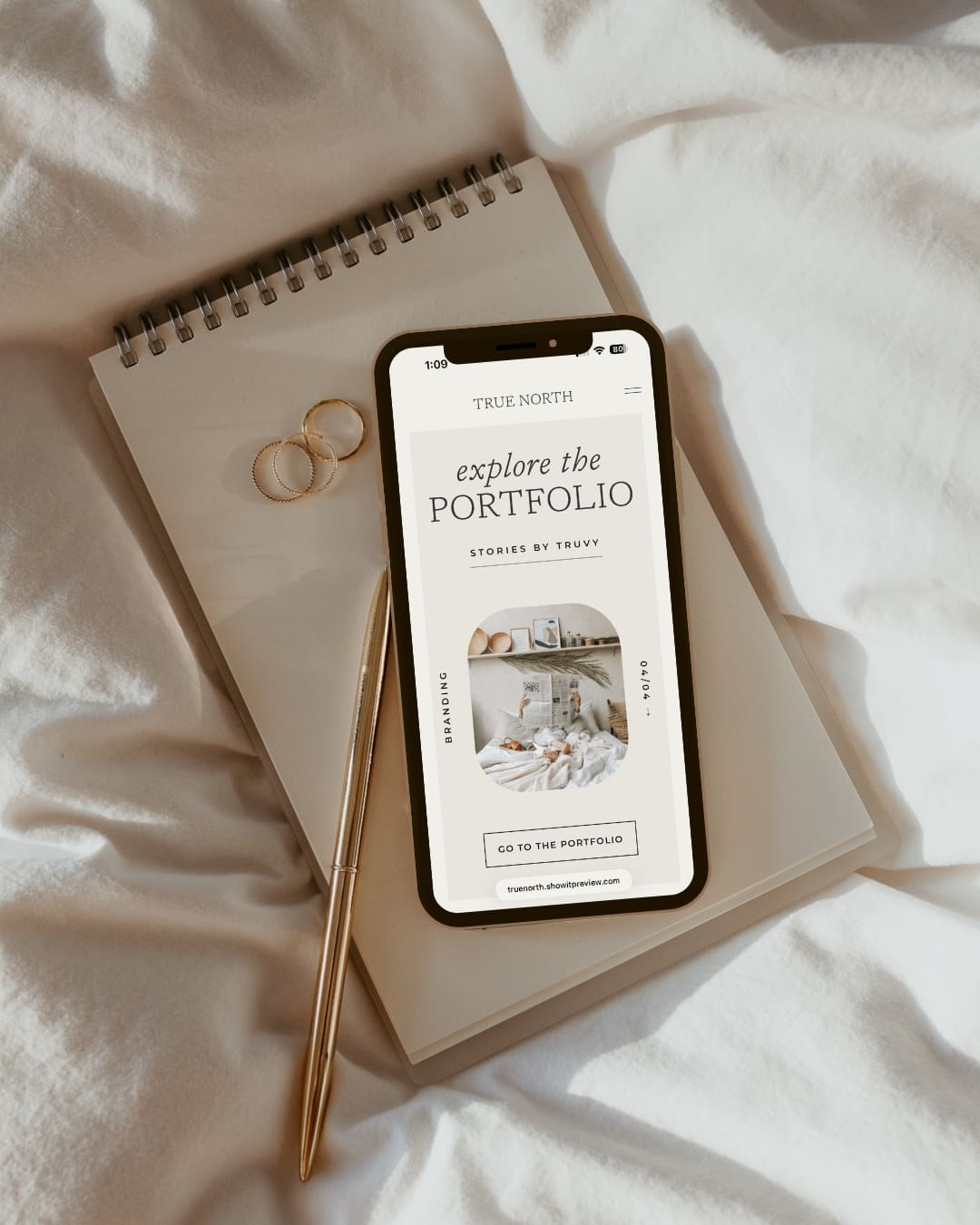
In fact, it’s one of the ideas behind the True North Showit template.
The goal wasn’t to create a website that felt trendy or complicated.
Breathing room, thoughtful image presentation, and a more curated experience that allows the right work to stand out.
Because the goal isn’t to show everything.
The goal is to help the right things shine.
And if you’re customizing a template yourself, this is one of the biggest places photographers can get off track: adding, changing, and tweaking until the site loses the clarity that made the template work in the first place. This post goes deeper into that: The Biggest Mistakes Photographers Make When Customizing A Showit Template.
Whether your style leans clean and understated like True North or more editorial and romantic like Cloe, the goal is the same: thoughtful curation that helps the right work shine.
Key Takeaways
- Luxury websites are defined more by curation than aesthetics.
- Showing fewer, stronger images often creates a more elevated experience.
- Consistency and cohesion in images and messaging builds trust.
- Thoughtful sequencing helps visitors connect with your work.
- Simplicity and restraint often feel more premium than complexity.
- The strongest brands know what to leave out.
FAQs
Can a Showit template feel luxury?
Absolutely. Luxury comes from thoughtful curation, strong, cohesive imagery, clear messaging, and intentional design decisions—not whether a website was custom-built.
Do I need a custom website to attract luxury clients?
No. Many photographers attract high-end clients using strategically designed templates that align with their brand and portfolio. Here’s a breakdown of what might be right for your business: How Much Should You Spend on a Showit Website.
How many images should I show on my website?
There’s no perfect number, but most photographers benefit from showing fewer images than they think. Focus on your strongest, most on-brand work. Ask, “Do I want to do more work like this?” If the answer is no, it probably doesn’t belong.
Does luxury mean minimalist?
Not necessarily. Luxury websites tend to be intentional and curated, but that doesn’t always mean minimal or neutral. Bold colors and design can often resonate with a luxury audience as well. Thoughtful curation remains the key to attracting the audience you’re after.
A Thoughtful Next Step
If you’re looking for a Showit template designed around clarity, curation, and thoughtful image presentation, explore the Pinkerton House Template Shop.
And if you’d rather have help bringing your website to life, done-for-you Website Design may be the better fit.
Kelsie Pinkerton is a Showit website designer and founder of Pinkerton House, with 20 years of experience in the luxury wedding industry.


")


")

")
")
")

")

")
")


